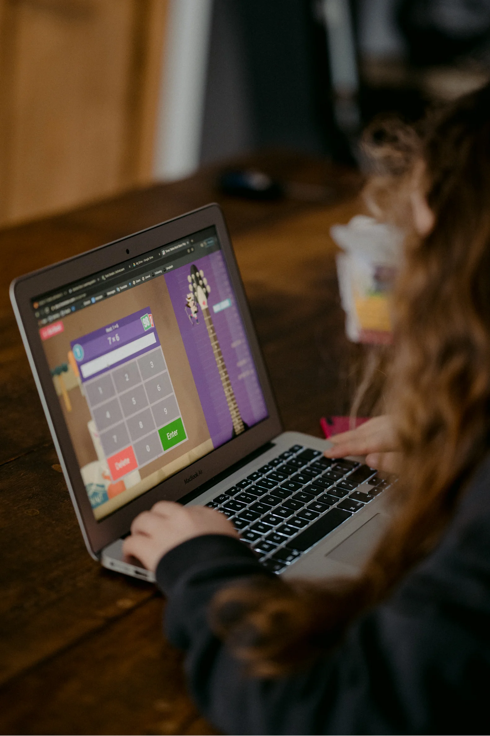
Redefining and enhancing the user experience of a leading learning app
How Enfin’s user experience research and design were utilized to improve user experience of an e-learning platform which significantly improved user retention rate.
- Industry
- Education
- Business Type
- Startup
- Services provided
- User Experience Research, UX Design, Wireframing and UI Design
Redefining and enhancing the user experience of a leading learning app
- Industry
- Education
- Business Type
- Startup
- Services provided
- User Experience Research, UX Design, Wireframing and UI Design
Overview
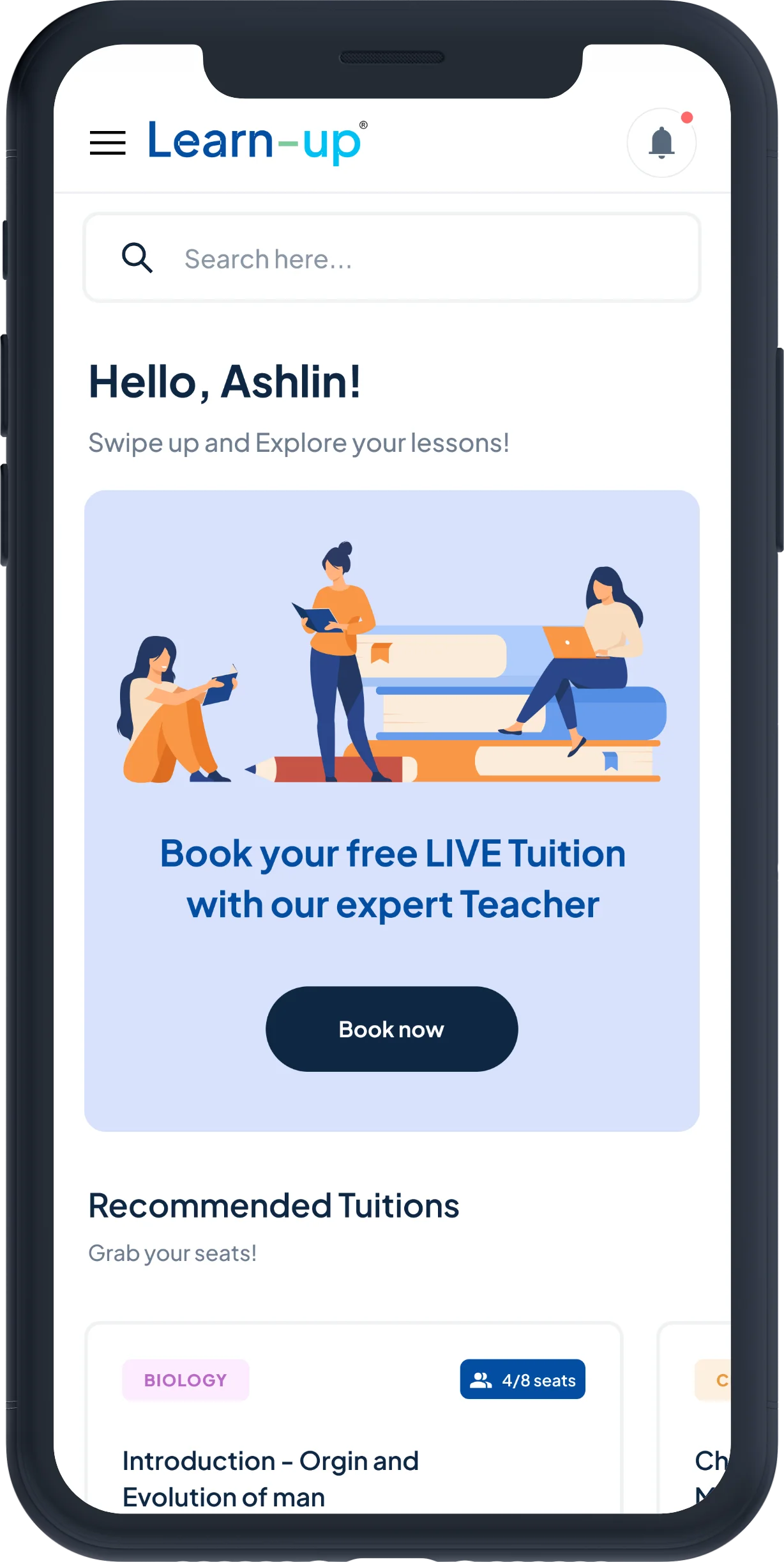
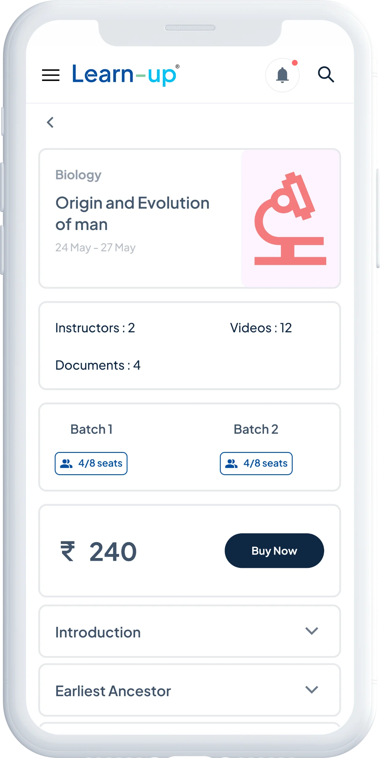
The client is one of the leading EdTech startups in India that specializes in delivering online video-based interactive courses to K12 students. They also offer one-to-one LIVE tuition packages to their students. The company has received a substantial amount of funding, making it a highly competitive player in the Indian EdTech market.
Goal
Despite their innovative and effective teaching methods, the client’s existing platform was not user-friendly. Despite investing heavily in marketing campaigns, user sign-ups were low. Additionally, even registered learners and tutors struggled to navigate through different features, leading to a disorganized user journey that negatively impacted students’ learning.
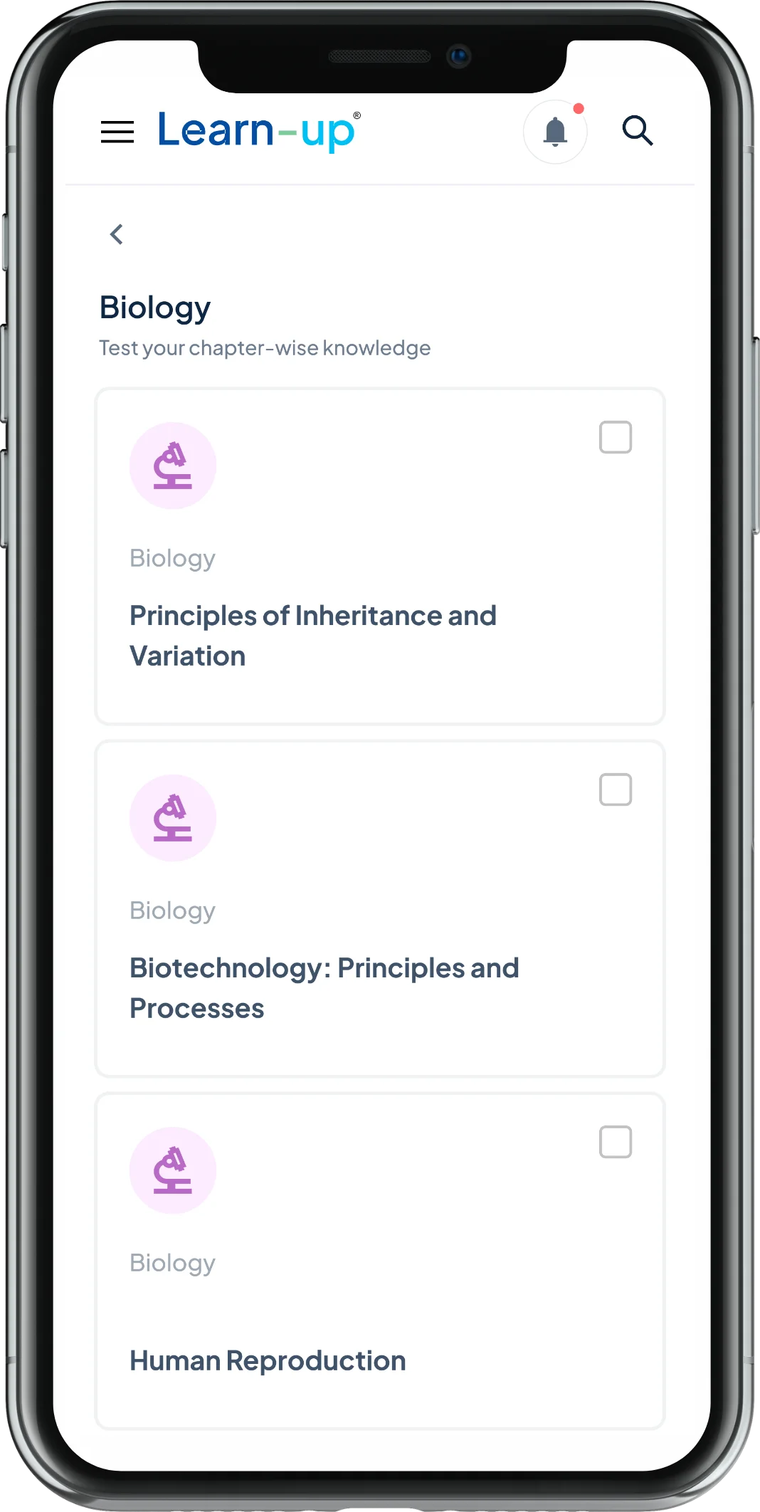
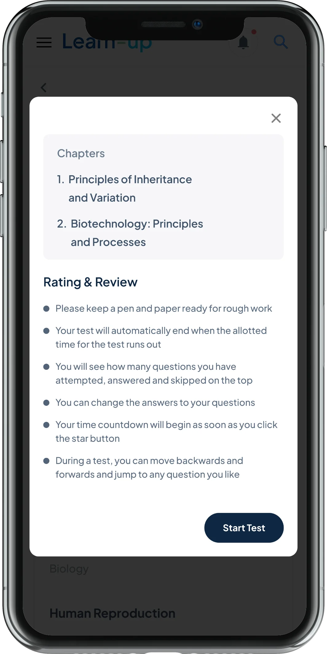
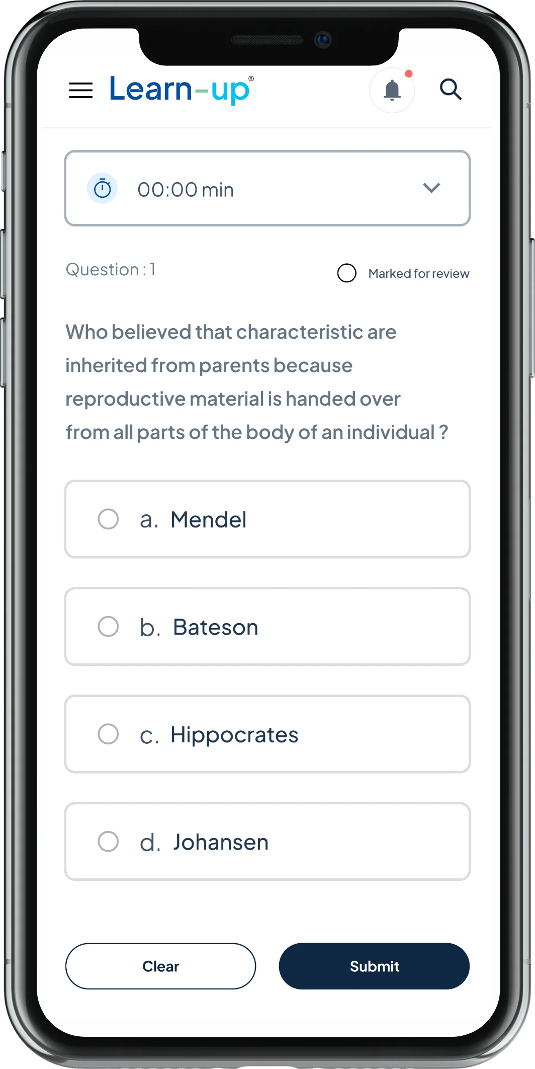
Solution
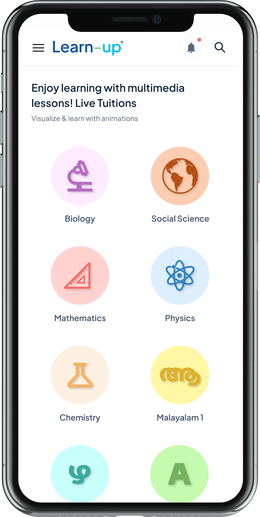
Designing a learner-friendly user experience
Our UX team has gone through the following process to achieve a fool-proof result.
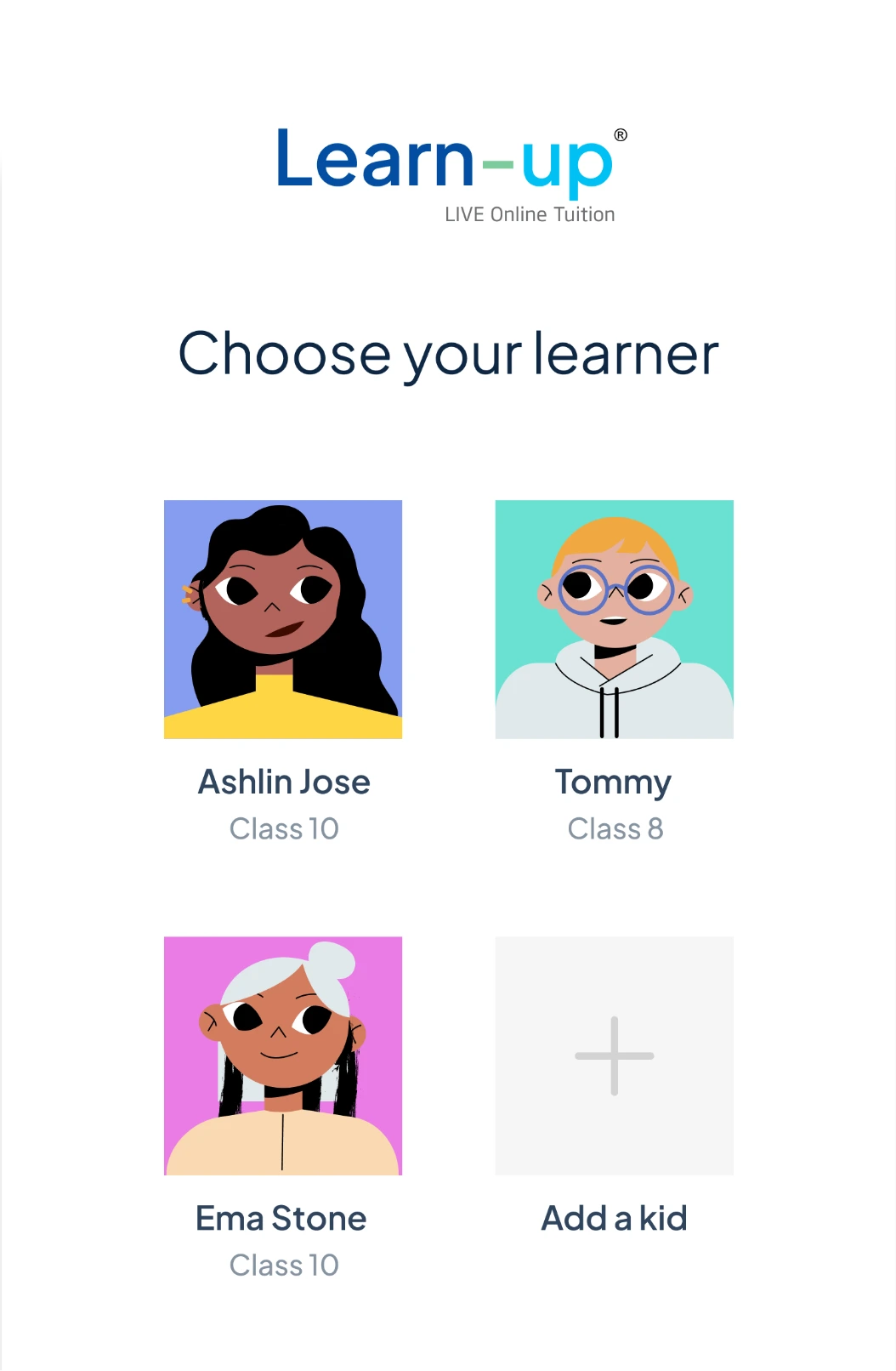
1. User Journey Research: Our team of UX experts and business analysts began by conducting a thorough UX review and research on the platform. The user journey research involved conducting interviews with the client’s targeted users, including students of different age groups, teachers, and parents. This allowed us to identify pain points and areas of improvement in the user journey.
2. User Flow & Wireframing: Based on the user journey research, we created user flows for both studentsand teachers, mapping out their journey on the platform. The next step was to begin creating wireframes for both web and mobile platforms, providing a blueprint for the UI design. The wireframes allowed us to test and iterate on different layout options, making sure that the user experience was optimal.
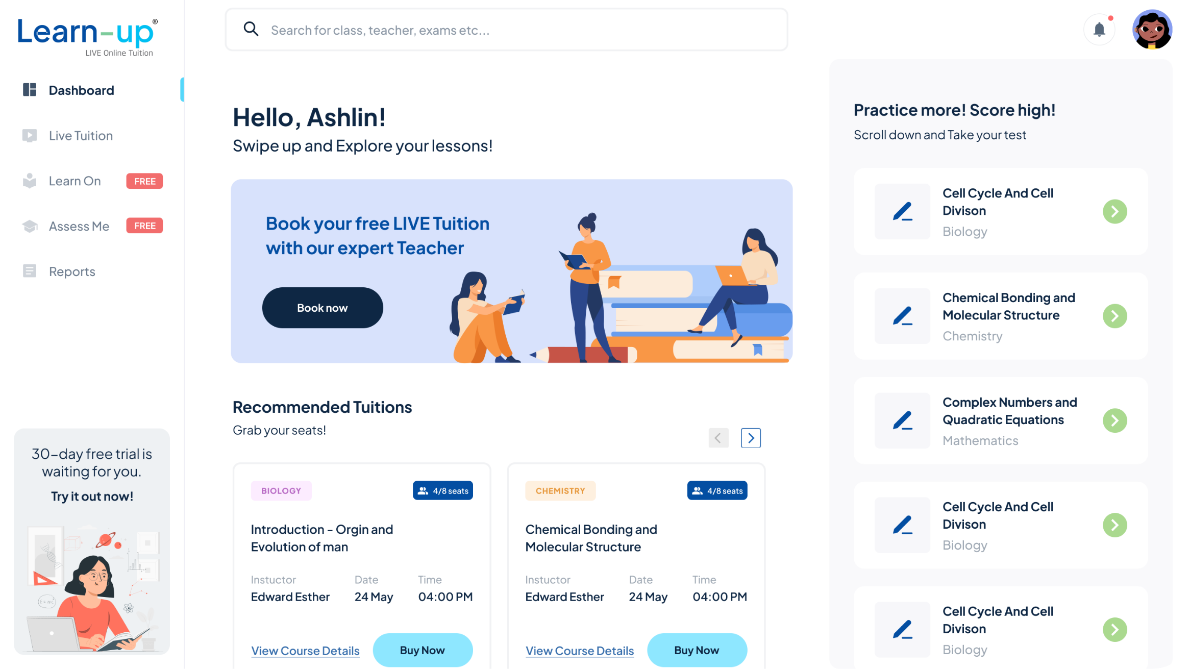
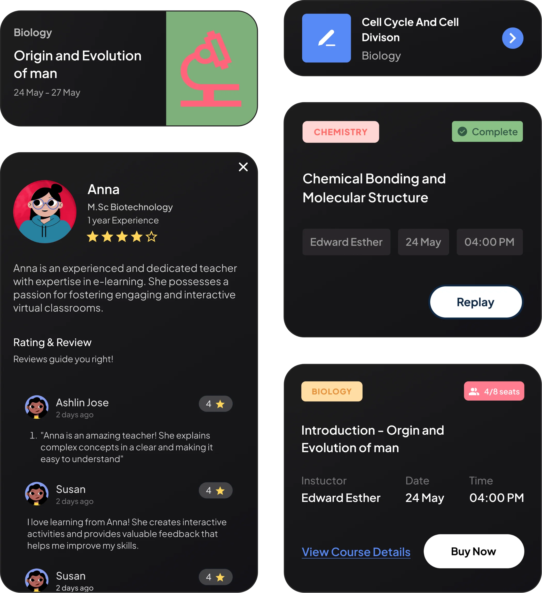
3. UI Design: Once we had finalized the wireframes, we moved on to creating high-fidelity UI designs. We made sure to adhere to the client’s branding guidelines, ensuring that the new designs were seamlessly integrated with their existing branding. We also made sure to optimize the design for both web and mobile platforms, creating a consistent experience across different devices.
4. Usability Testing: To validate our design decisions, we conducted usability testing with actual users. This allowed us to identify any remaining pain points and areas for improvement. Based on the user feedback, we made further adjustments to the design, refining it until we achieved the optimal user experience.
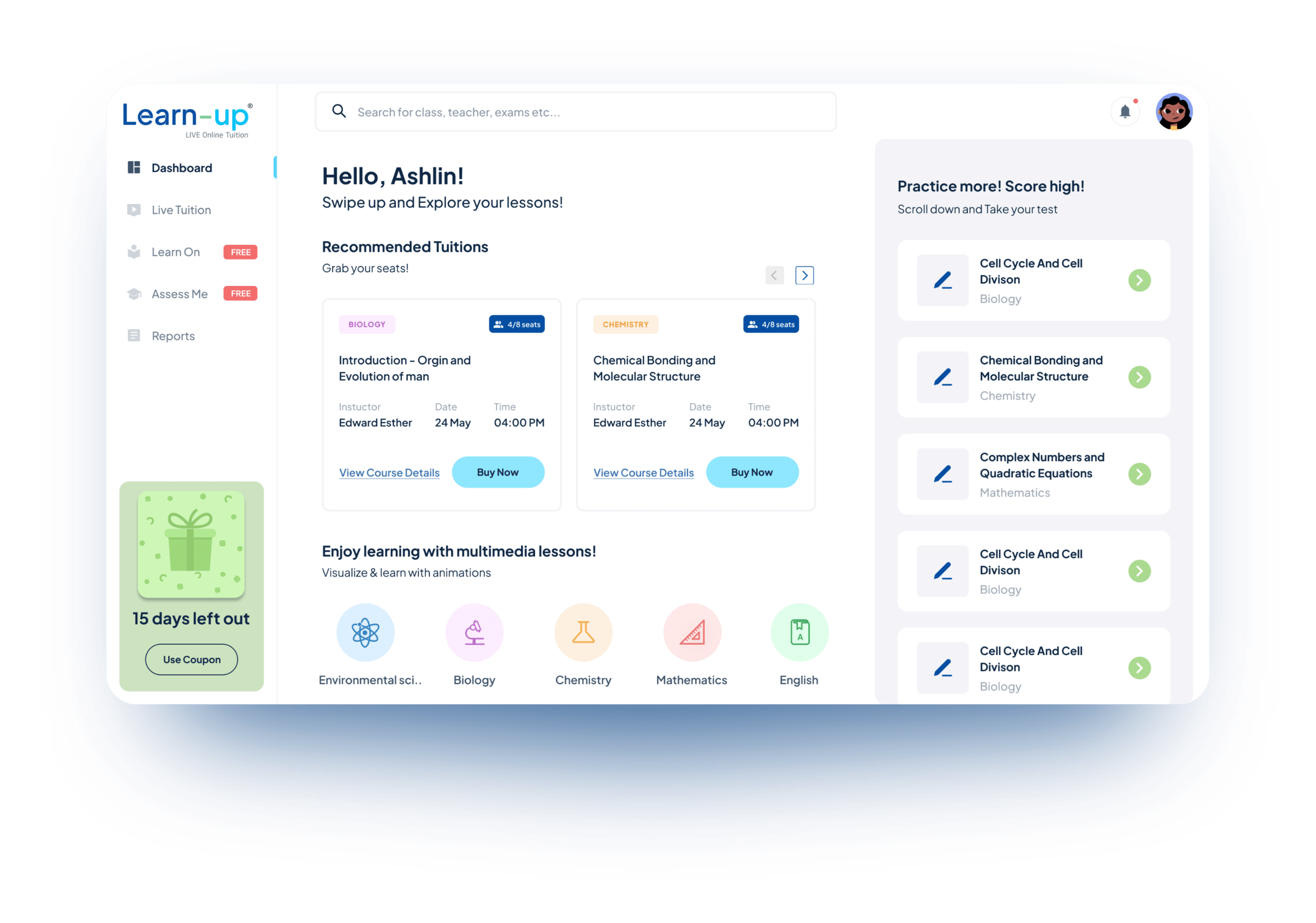
Result
Increased user sign-ups & retention rate
The new user-friendly design significantly improved the student's learning experience.
38%
increased user sign-up rate
28%
improved user retention
57%
increased course view time and learner interactivity with the platform
Conclusion
By following a thorough UX and UI design process, our team was able to help the client improve their user journey, resulting in a more user-friendly platform that significantly improved the student learning experience. The design changes were validated through user testing, and the final product exceeded our client’s expectations. This client story demonstrates the importance of UX and UI design in creating successful digital products.
More Client Stories
Discover how Enfin Technologies redefined the digital learning experience with an advanced virtual classroom setup, bringing an unparalleled, in-person classroom feel to online education for a prominent business school.
How Government Medical College Thiruvananthapuram Successfully Conducted Online Classes During Covid-19 using the virtual classroom solution developed by Enfin
- Previous
- Next


